Pulp Librarian Profile picture
Sep 30, 2018 15 tweets 8 min read Read on X
What font should be on your book cover? Well if you've had it with Helvetica and you're fed up with Futura why not revive a classic pulp typeface or two? As it's #FontSunday here's my list of some pulpy fonts that are fruitier than Frutiger and louder than DIN 1931...
Any pulp sci-fi writer must give serious consideration to using Amelia as their book cover typeface. Designed by Stan Davis in 1964 it's the font used on the Moon Boot and reminds people we haven't actually been to the Moon since 1972, so we really should try again!
If your story is about computers then use Computer Monotone! David Moore created this in 1968 as an alphabetical extension of the E-13B font used on the bottom of cheques. It smells of Fortran an tastes of 4 bit processing, just like a real computer should...
For action stories you'll probably want to use Colin Brignall's 1965 font Countdown - as used on Countdown comic (d'uh!) as well as Byte magazine. You can almost hear the seconds counting down at the end of Rollerball as you squint at the text.
A sensuous book needs a sensuous font, and nothing smells more of white musk than Davida. Designed by Louis Minott in 1965 its languid curls conjure up a russet world of Bailey's Irish Cream sipped by a roaring log-effect gas fire. Bliss...
For female detective novels you should consider using Peignot, the Mary Tyler Moore font. Its ponderous Gs and pensive Ys suggest a steely feminine thoughtfulness and perspicacity, perfect for your intrepid heroine.
If you're writing gothic romance (and if not why not?) you may be considering a cursive typeface for your cover, such as Bookman Swash. But have you considered Albertus? It's the font from The Prisoner, so it's perfect for your heroine with great hair fleeing that gothic house!
For fantasy fiction the only typeface you need is the 1894 version of Bradley. Less fussy than Morris Troy and less shouty than American Text it was designed by Will Bradley for a Christmas issue of The Inland Printer. It is the font of wizards, winters and sensitive Goths.
An action hero needs a heavyweight font, which is why The Black Samurai always uses Novel Gothic. Charles Becker's 1928 typeface is smooth, sharp and heavy-hitting, just like our hero Robert Sand.
For a more film noir look you may want to take a trip from Pan Books and plump for Fanfare. Designed in 1927 it's a big-shouldered bruiser of a font that looks dangerous and acts slightly deranged. Perfect for the doomed anti-hero type.
If you want real impact don't use Impact font, instead go for Futura ND Black - Bauer's 1929 heavyweight champion of a typeface. It's big, bold and aesthetically correct, giving more bang for your buck!
In pulp you can never be too bold, especially with typefaces. Gill Kayo Ultra Bold has a nice Clockwork Orange vibe, whilst Humanist 521 Ultra Bold is a veritable dreadnaut amongst fonts. Let battle commence!
Don't be afraid to play against type with fonts. You may think that the Art Nouveau feel of Arnold Böcklin wouldn't work for sci-fi, but its 1904 arts and crafts styling adds an esoteric imprimatur to these Bruce Pennington covers. The title sets the tone...
And finally... how can we not acknowledge the twin princes of sixties typefaces: Mania and Obese! These two similar 1968 fonts are fat, funky and fantastic. Every glyph is a brow-beating heavy leather resurrection shuffle of enjoyment, so go on - let the good times roll!
Your publisher may think otherwise but trust me: less isn't more, less is a bore! Your typeface should be as shameless and brazen as your story, so whatever you choose keep it pulpy!

More stories another time...

• • •

Missing some Tweet in this thread? You can try to force a refresh
 

Keep Current with Pulp Librarian

Pulp Librarian Profile picture

Stay in touch and get notified when new unrolls are available from this author!

Read all threads

This Thread may be Removed Anytime!

PDF

Twitter may remove this content at anytime! Save it as PDF for later use!

Try unrolling a thread yourself!

how to unroll video
  1. Follow @ThreadReaderApp to mention us!

  2. From a Twitter thread mention us with a keyword "unroll"
@threadreaderapp unroll

Practice here first or read more on our help page!

More from @PulpLibrarian

Dec 2, 2018
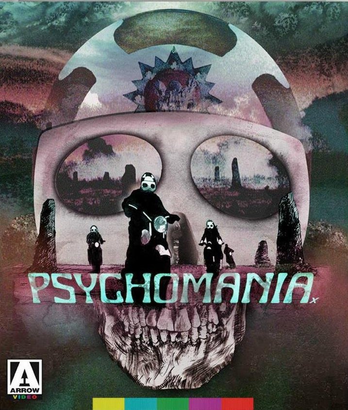
It is the greatest frog-worshiping zombie biker occult horror film ever made. Possibly the only one. It's certainly like no over movie you've ever seen.

Today in pulp, I look back at the 1971 classic Psychomania...
By the early 1970s British horror films were trying to get 'with it' to attract a younger audience. So it wasn't surprising that in 1971 screenwriter Arnaud d'Usseau tried to create a biker horror movie.
d'Usseau had previously written Horror Express, an Anglo-Spanish sci-fi/horror movie loosely based on John W. Campbell's novella Who Goes There. Christopher Lee, Peter Cushing and Telly Savalas did their best with the material.
Read 18 tweets
Oct 9, 2018
"The gun is good! The Penis is evil!" bellows a huge stone head floating over the Irish countryside. It's quite a strange start to any movie, but it's about to get even stranger...

This is the story of John Boorman's classic 1974 film Zardoz.
In 1970 director John Boorman began work on a Lord Of The Rings film for United Artists. It would be an unusual adaption; The Beatles would be the Hobbits and Kabuki theatre would open the movie . Alas the studio said 'No', but the idea of a fantasy film stuck with Boorman...
So in 1972, following the commercial success of Deliverance, John Boorman started work on Zardoz - a fantasy film into which he would cram many unorthodox ideas. Initially Burt Reynolds was to play the lead role of Zed, but pulled out citing other filming commitments.
Read 13 tweets
Oct 8, 2018
As it's #LibrariesWeek let's look back at Britain's favourite library book*: the 1977 Usborne Guide to the Supernatural World!

(*according to my readers)
Supernatural World was an anthology of three existing Usborne pocketbooks: Vampires, Mysterious Powers and Ghosts. As an Usborne hardback it was deemed perfect for the nation's libraries.
Usborne had previously fascinated and frightened readers with its 1977 World Of The Unknown series: a terrifying triptych of ghosts, monsters and UFOs. Supernatural World would continue in the same vein.
Read 12 tweets
Oct 7, 2018
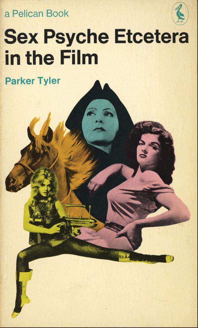
It was a university course for the price of a packet of cigarettes: Pelican Books! Maybe the blend wasn't to everyone's taste, but there's no denying the addictive nature of the range.

Today in pulp I look back at the autodidact's bible...
In 1937, two years after Allen Lane founded Penguin books, the company decided on a new imprint to provide academic and intellectual non-fiction for the general public. Lane believed there was a market for “intelligent books at a low price” which he was determined to serve
Over its lifetime Pelican sold a quarter of a billion books covering almost 3,000 subjects. Lane apparently came up with the Pelican name when he overheard a woman at King’s Cross railway station mistakenly asking for a Pelican book instead of a Penguin one.
Read 14 tweets
Oct 7, 2018
📩PULP POSTBAG TIME!📩

And today's letter is home computer related...
Mr Derrick Wibley from Penge writes: "Dear PL, I recently invested in a 48k ZX Spectrum to help run my stationery business 'Penge Pens'. However I'm worried it's not powerful enough to meet the needs of my ambitious business expansion programme. What should I do?"
Well Mr Wibley fear not! The ZX Spectrum is a fully-scaleable integrated solution to your business needs - provided you buy the right peripherals!
Read 13 tweets
Oct 6, 2018
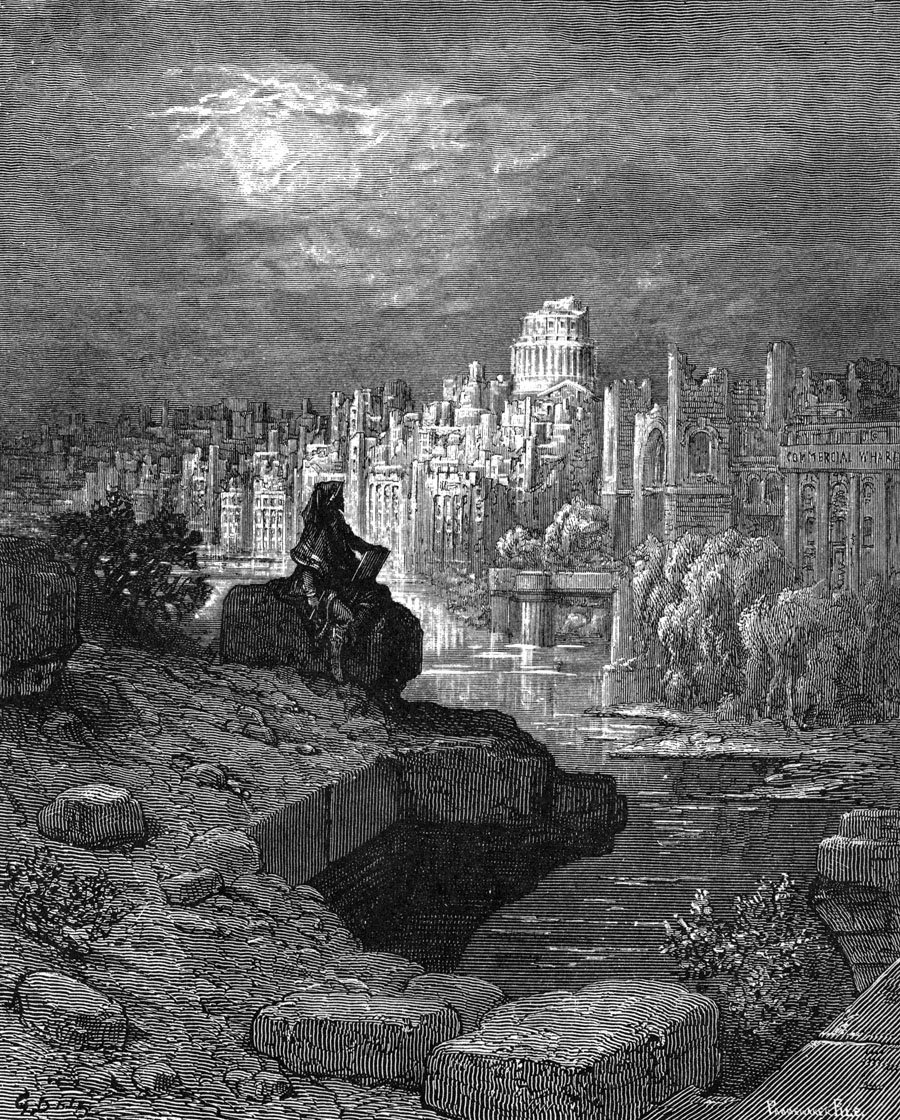
The Time Machine, Brave New World, 1984: these weren’t the first dystopian novels. There's an interesting history of Victorian and Edwardian literature looking at the impact of modernity on humans and finding it worrying.

Today in pulp I look at some early dystopian books…
Paris in the Twentieth Century, written in 1863, was the second novel penned by Jules Verne. However his publisher Pierre-Jules Hetzel rejected it as too gloomy. The manuscript was only discovered in 1994 when Verne’s grandson hired a locksmith to break into an old family safe.
The novel, set in 1961, warns of the dangers of a utilitarian culture. Paris has street lights, motor cars and the electric chair but no artists or writers any more. Instead industry and commerce dominate and citizens see themselves as cogs in a great economic machine.
Read 26 tweets

Did Thread Reader help you today?

Support us! We are indie developers!


This site is made by just two indie developers on a laptop doing marketing, support and development! Read more about the story.

Become a Premium Member ($3/month or $30/year) and get exclusive features!

Become Premium

Don't want to be a Premium member but still want to support us?

Make a small donation by buying us coffee ($5) or help with server cost ($10)

Donate via Paypal

Or Donate anonymously using crypto!

Ethereum

0xfe58350B80634f60Fa6Dc149a72b4DFbc17D341E copy

Bitcoin

3ATGMxNzCUFzxpMCHL5sWSt4DVtS8UqXpi copy

Thank you for your support!

Follow Us!

:(