Dan Quintana Profile picture
May 3, 2018 20 tweets 7 min read Twitter logo Read on Twitter
Funnel plots are often used to assess publication bias in meta-analysis, but these plots only visualise *small study* bias, which may or may not include publication bias. Here's a guide on making contour-enhanced funnel plots in #Rstats, which better visualise publication bias
First, some background.... Publication bias is a well-known source of bias. For instance, researchers might shelve studies that aren’t statistically significant, as journals are unfortunately less likely to publish these kind of results.
Researchers might also use questionable research practices — also known as p-hacking — to nudge an effect across the line to statistical significance
Two interrelated approaches are typically used to assess the risk of publication bias in meta-analysis. First, the risk of publication bias is often visualised by constructing a funnel plot, which visualizes a measure of effect size against a measure variance
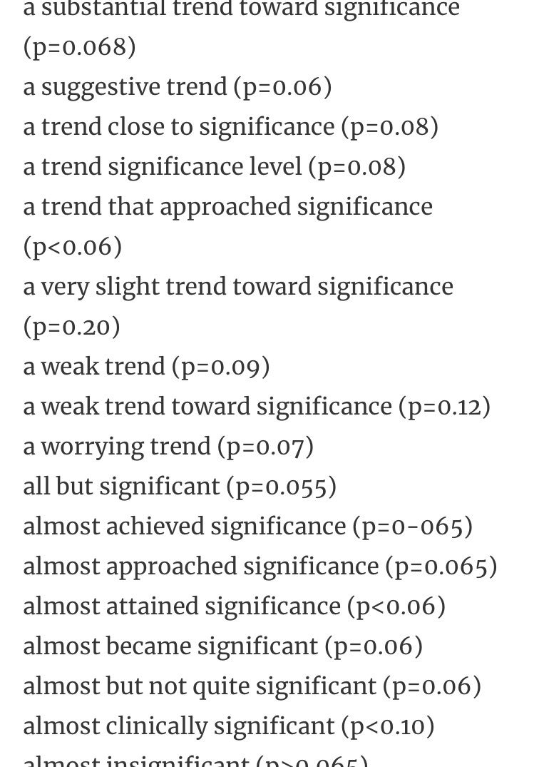
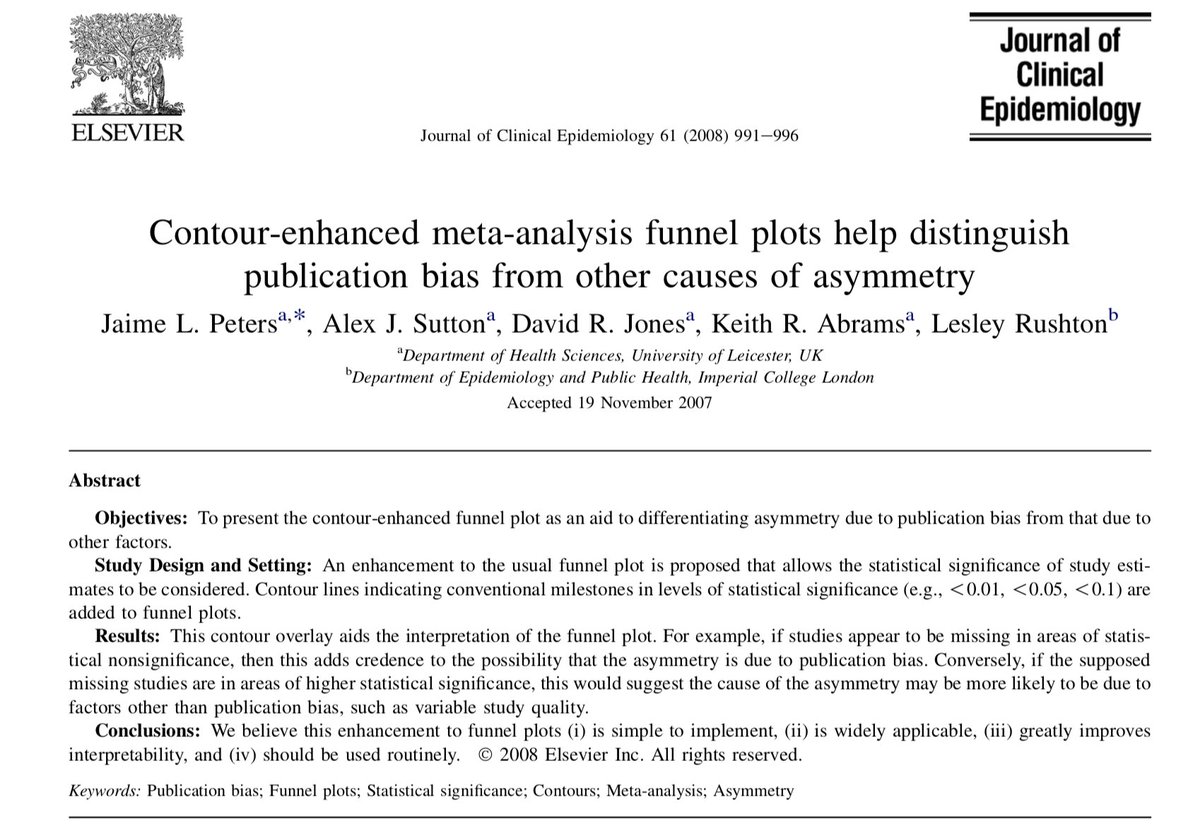
Let’s consider these two funnel plots. Plot A seems to be fairly symmetrical, with roughly the same number of studies either size of the summary effect size. Studies with greater variance have a larger spread around the summary effect size, near the bottom of the plot.
In contrast, Plot B is not symmetrical. It seems that the studies with more variance (i.e., studies with fewer participants) only fall to the right of the summary effect size. Many researchers would conclude that plot B is indicative of publication bias, due to the asymmetry.
Second, Egger’s regression test is often used as an objective measure of funnel plot asymmetry, as it assesses the relationship between the effect size and a measure of variance. A statistically significant effect is indicative of funnel plot asymmetry bmj.com/content/315/71…
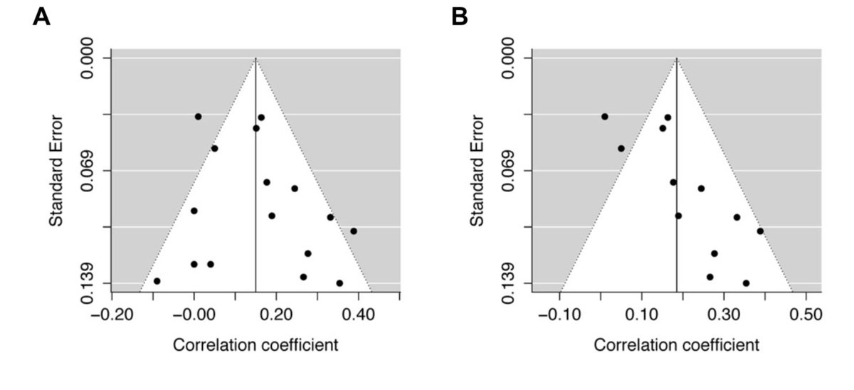
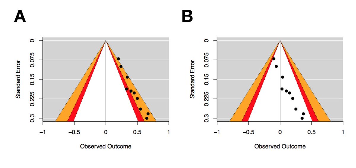
Now let’s consider the two new funnel plots, each with ten effect sizes. Both plots demonstrate asymmetry, but note the differences in observed outcomes (i.e., effect sizes). The effect sizes in Plot A range from .2 to .65, whereas the effect sizes in plot B range from -.1 to .35
For a given range of effect sizes and variances, it’s possible to calculate statistical significance for any combination of these two variables. This means you can easily superimpose a set of significance thresholds on a traditional funnel plot.
These plots are called contour-enhanced funnel plots, and were first described by Peters and colleagues in 2008 ncbi.nlm.nih.gov/pubmed/18538991
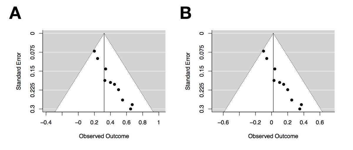
These funnel plots are a duplicate of the previous plots, except key areas of statistical significance have been added to the funnel, and the plot is now centred at zero. The red zones show effects between p=.1 & p=.05, and the orange zones show effects between p=.05 & p=.01
Egger’s regression test for both of these plots yield identical outcomes (z = 2.78, p = 0.01), which are suggestive of asymmetry. However, there’s a clear pattern in plot A, with studies falling into the statistical significance channel on the right of the funnel.
Plot B displays clear asymmetry, but none of the studies are statistically significant. So despite this asymmetry, it's likely that factors other than publication bias are contributing to this funnel plot asymmetry.
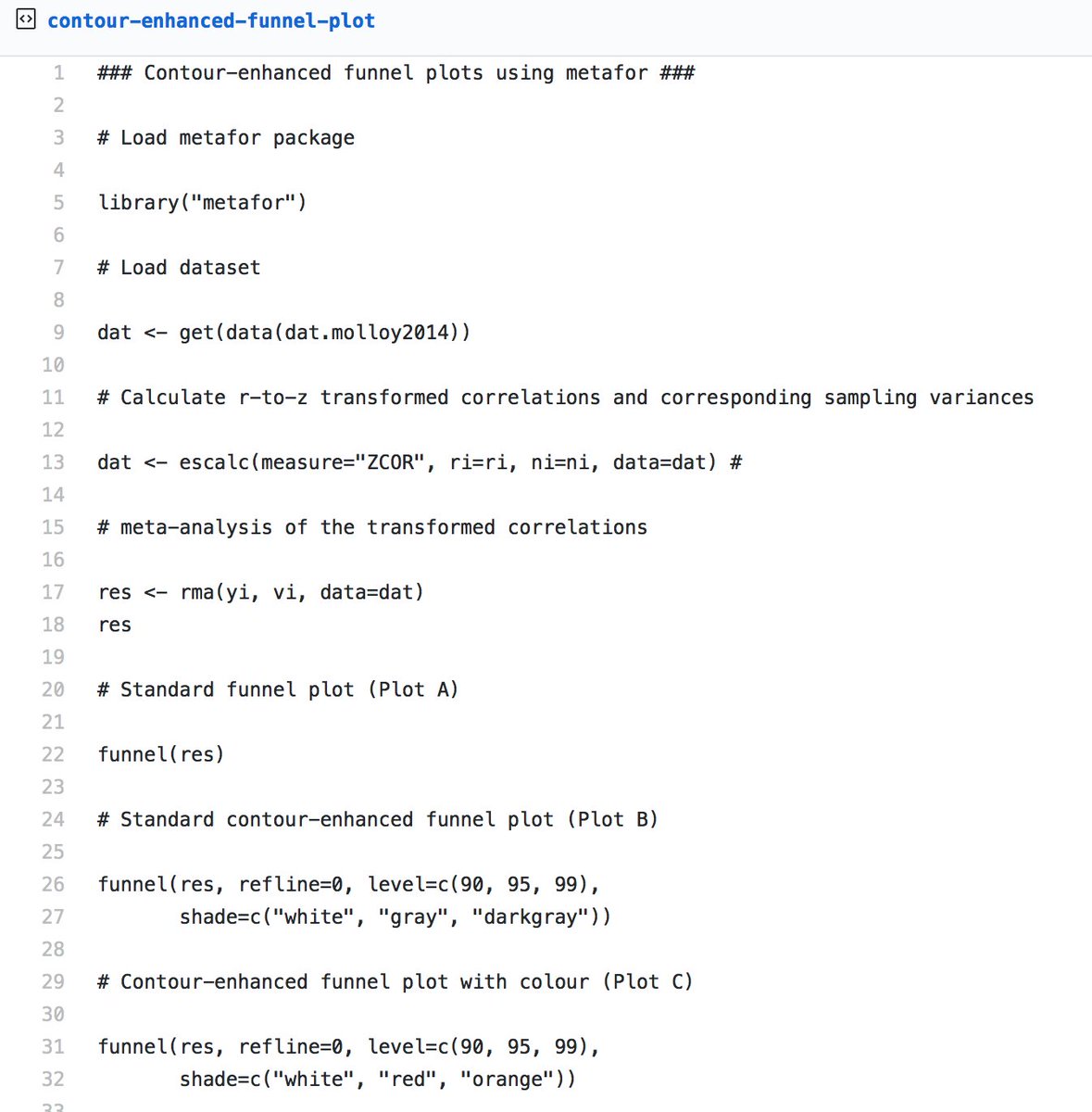
To make your own contour-enhanced funnel plots, you can use this R script gist.github.com/dsquintana/b4a… This script will generate a standard funnel plot and three different contour-enhanced funnel plots, using the metafor package
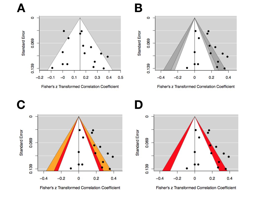
Plot A is a standard funnel plot. Plot B is a contour enhanced funnel plot — note that the vertical reference line is now at zero. Plot C has added a little colour, and Plot D has adjusted the contour lines to a single contour between p=.05 & =.01
While contour-enhanced funnel plots are handy, they cannot be used to objectively assess the risk of p-hacking, or the degree of effect size inflation. Despite these limitations, funnel plots can still provide a valuable addition to the visualisation of meta-analyses.
If you’re new to R, you should check out my step-by-step tutorial paper for performing your own correlational meta-analysis frontiersin.org/articles/10.33… I also put together a companion video, if that’s more your thing
One of the many benefits of using R for your analysis is that you can easily share the analysis script with your manuscript.
Open materials are usually promoted for the purpose of other scientists to reproduce your analysis. However, you’ll quickly learn that one of biggest beneficiaries of open materials is your *future-self*, for when you need to revisit analyses.
Here’s the blog post version of this thread medium.com/@dsquintana/co…

• • •

Missing some Tweet in this thread? You can try to force a refresh
 

Keep Current with Dan Quintana

Dan Quintana Profile picture

Stay in touch and get notified when new unrolls are available from this author!

Read all threads

This Thread may be Removed Anytime!

PDF

Twitter may remove this content at anytime! Save it as PDF for later use!

Try unrolling a thread yourself!

how to unroll video
  1. Follow @ThreadReaderApp to mention us!

  2. From a Twitter thread mention us with a keyword "unroll"
@threadreaderapp unroll

Practice here first or read more on our help page!

More from @dsquintana

Jul 24, 2018
You’ve worked hard putting together a presentation so why limit it to the people sitting in your talk?

Here are a few tips for repurposing your talk for sharing on social media
1. Add your twitter handle on your intro slide and encourage your audience to tweet. Limiting the text on your slides will also encourage tweets. If your text isn’t tweetable then there’s too much text.

Even if people are reading it, they’re not listening to you
What’s better than big blocks of text?

Images!

Use @unsplash for a huge library of free and high quality images that don’t require distracting attribution text at the bottom of your slide
Read 11 tweets
May 7, 2018
If you’re an academic you need a website so that people can easily find info about your research and publications. Here’s how to make your own website for free in an under an hour using the blogdown package in #Rstats [THREAD]
So why use blogdown? Sure, there are several free options available to start your own blog (e.g., Medium). However, you generally can’t list your publications or other information easily on these services. Also, who knows where these services will be in a few years?
There are also some great point-and-click services available (e.g., Squarespace). However, you need to pay about $10 a month for these services, and they’re generally not well suited for academic webpages.
Read 23 tweets
May 4, 2018
Every paper has open data if they present a scatterplot.

1) Download WebPlotDigitizer automeris.io/WebPlotDigitiz…
2) Load a scatterplot screenshot
3) Select each datapoint
4) Download the .CSV file with each datapoint
We used this tool in a recent meta-analysis to extract correlation coefficients from papers that didn't report coefficients (only scatterplots), which is a common issue in meta-analysis sciencedirect.com/science/articl…
We validated the use of WebPlotDigitizer in our sample by looking at studies in our meta-analysis that reported BOTH correlation coefficients and scatterplots, finding high precision
Read 6 tweets
Apr 26, 2018
Here are ten things that I HAVE NOT changed my mind about in the past few years of being a scientist (thanks to @mareberl for the suggestion)
1. Meta-analysis is a useful means of synthesizing research

Meta-analysis cops a lot of flak. But like ANY statistical tool, meta-analysis needs to be correctly applied. It still sits on top of the evidence pyramid osf.io/yq59d/
2. Presentation skills are undervalued

It’s likely that one day your chances of landing a job/grant will ride on a presentation, so take EVERY OPPORTUNITY to practice. Your research won’t “speak for itself”, no matter how good it is.
Read 11 tweets
Apr 24, 2018
Here are ten things I’ve changed my mind about in the last few years of being a scientist
1. P-values are bad.

Nope. P-values are good for what they’re designed to do. Just because they’re (often) misused doesn’t mean that we should abandon them.
2. Bayes factors will save us from the misuse of p-values

No. Bayes factors *can* be useful, but they’re not always the solution to p-value limitations.
Read 13 tweets
Apr 23, 2018
Meta-analyses are often used as a gold standard measure of evidence. But how much trust should you place in a meta-analysis outcome? Here are a few things you should look out for next time you read one [THREAD]
1. Don’t just check whether the authors state they followed PRISMA/MARS reporting guidelines, check whether they ACTUALLY did.

prisma-statement.org

SPOILER ALERT: Very few do. The ones that do *typically* include a checklist in the supplement
2. Was the analysis protocol pre-registered? There is SO much analytical flexibility in meta-analysis, so this is a crucial point. Sometimes all it takes is a small tweak of study exclusion criteria to tip a summary effect size over the line to p = .048 (or closer to p = .05)
Read 20 tweets

Did Thread Reader help you today?

Support us! We are indie developers!


This site is made by just two indie developers on a laptop doing marketing, support and development! Read more about the story.

Become a Premium Member ($3/month or $30/year) and get exclusive features!

Become Premium

Don't want to be a Premium member but still want to support us?

Make a small donation by buying us coffee ($5) or help with server cost ($10)

Donate via Paypal

Or Donate anonymously using crypto!

Ethereum

0xfe58350B80634f60Fa6Dc149a72b4DFbc17D341E copy

Bitcoin

3ATGMxNzCUFzxpMCHL5sWSt4DVtS8UqXpi copy

Thank you for your support!

Follow Us on Twitter!

:(